Migration is the movement of people from one place to another and can be internal or external. Internal migration occurs when people move within the same region or country. In contrast, external migration happens when people leave one country for another.
In Kenya, we study migration patterns to understand where people are migrating to, where they are coming from, and what factors influence their decisions to migrate. So far, it's apparent that education, jobs, and marriage influence migration.[1]
Other factors, such as climate change, have started to gain importance and are likely to influence migratory trends in the future.[2]
The difference between lifetime and recent migration
People migrate to other regions to settle either temporarily or permanently. Recent migration occurs when a person moves into a county one year before the census.
Lifetime migration, on the other hand, includes recent migrants as well as older migrants who moved in earlier. This could be any time between when they were born and the time of the census.
Lifetime migration by county: Where are Kenyans coming from, and where do they go
Counties are not static, and many people come in as others leave. When people leave a specific county, that is out-migration, represented by the red bars in the chart below. When people enter a county, that is in-migration, shown in blue.
In absolute numbers, Kakamega had the highest number of lifetime out-migrants in 2019, with 598,246 people leaving the county compared to 188,725 who came in.[3]
Nairobi had the second-highest out-migration rate, with 570,480 people leaving the county. However, Nairobi had the highest number of in-migrants, at 2,569,222. Murang'a County was third, with 516,171 people leaving and 167,208 coming in.
Overall, most rural counties had more people migrating out and only a few people coming in. Counties with large urban centres such as Nairobi, Nakuru, Mombasa, Kiambu, Uasin Gishu, and Trans Nzoia recorded a higher number of in-migrations than out-migrations.
Migration contributes to population growth when in-migration is higher than out-migration.
Besides fertility rate, birth rates and mortality rates, migration is an essential influence on a region's population growth rate. When the number of in-migrants exceeds that of out-migrants, migration contributes to population and labour force growth.[4]
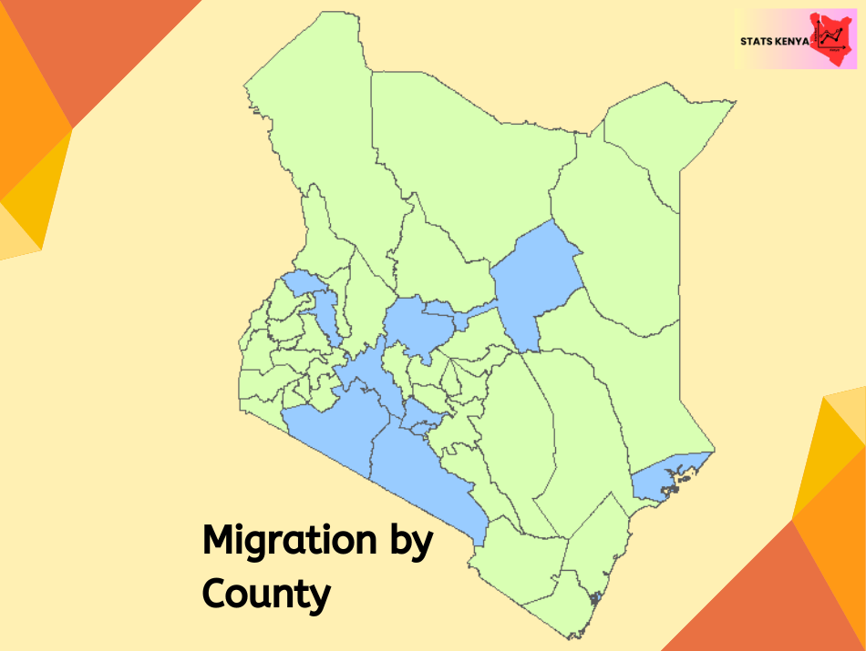
For instance, for a country like Nairobi, 570,480 people were out-migrants, while 2,569,222 were in-migrants. That means migration contributed 1,998,742 people to Nairobi's population. The map below shows counties that gained more people from migration and those that lost.
While absolute migration numbers can be informative, we cannot fully grasp the extent of migration without considering the net migration rate.[4] This is essential because counties with many people will have many migrants. However, that does not usually mean the extent of migration in or out is significant. We have to look at migration in light of the total population.
A significant share of the population in Nairobi, Mombasa, Kajiado, and Kiambu migrated from other counties.
Looking at the chart below, we find that Nairobi is a county of migrants, with 455 people out of every 1000 having been born elsewhere. Mombasa comes second, with 354 out of every 1000 people being migrants from other counties.
Nairobi and Mombasa are city counties with numerous job and education opportunities that attract many people.
Kajiado, Kiambu, and Nakuru benefit from spillover migrations to Nairobi, which Muyonga and colleagues call suburbanization.[5] In Kajiado, for instance, 344 out of every 1000 were born elsewhere, and in Kiambu, the rate is 266 per 1000.
On the other end of the chart, we see that some counties have higher out-migration rates, with a large share of their populations opting to leave.
That was the case in Vihiga County, where 503 people per 1000 had migrated to other counties. One reason for this is that Vihiga has one of the highest population densities in the country, creating land-related issues that force people to move out.[6]
Assuming zero migration, how many people would be in each county?
We ask this question out of curiosity rather than any practical significance. Unless you are a Sentinelese, the chances of a specific population being wholly closed out from contact and migration are pretty low. Regardless, it is interesting how county population data would change if counties were closed off from migration.
To find out, we only needed to subtract the in-migration numbers of each county from its total population and then add the out-migration numbers. As a result, we removed everyone who was not born in that county and added back those who were born but migrated elsewhere. The chart below shows what we get after this exercise.
What is apparent from the chart above is that most urban counties would lose most of their population to the rural counties. Nairobi, which as of 2019 had a population of 4,397,073, would lose close to half of its population for a total of 2,398,331. This is because, as seen earlier, 455 out of every 1,000 people in Nairobi migrated from elsewhere.
Counties with high net-out-migration rates, such as Vihiga, Murang'a, Nyeri, Kisii, Kitui, and Makueni, would see an increase in their populations as those who had left come back. Vihiga County would see a 50% increase in its current population. The population of Murang’a would increase by 33%, Nyeri by 32%, Kisii by 30%, Kitui by 24%, and Makueni by 22%.
How many people moved to their county of residence within a year of the census
Recent migration occurs when people enter or leave a county within a year of the census. It shows us short-term trends in people's movements and is beneficial in identifying which new counties have become magnets for people.
In the chart below, we see recent migration by county. Nairobi had the highest number of new residents, gaining 641,817 and losing 411,790. In Kakamega, 185,886 people left the county as 90,650 came in, and in Nakuru, 241,350 people entered and 159,296 left.
Overall, counties that had a net-positive recent migration were Nairobi, Mombasa, Lamu, Isiolo, Embu, Machakos, Nyandarua, Kirinyaga, Kiambu, Trans Nzoia, Uasin Gishu, Laikipia, Nakuru, Narok, and Kajiado.
When we compare lifetime and recent migration, we notice that Nyandarua, Embu, Kirinyaga, and Machakos had net-positive recent gains in migrants. The map below shows the additional counties that had higher in-migration than out-migration. The two maps also show that despite Kisumu hosting a city, it faces more out-migration than in-migration.
Recent migrants prefer Kajiado and Kiambu.
Nairobi County had the highest number of lifetime migrants per 1,000 people. However, looking at recent migrants, the change favours Kajiado and Kiambu. As the chart below shows, 90 people out of every 1,000 in Kajiado County moved there within a year of the census. In Kiambu, 72 people per 1,000 moved in one year before the census.
This suggests that Kajiado and Kiambu have become more desirable for recent migrants than Nairobi or Mombasa.
On the other hand, Vihiga County still had a higher out-migration rate than any other county. Ninety-seven people out of every 1,000 in the county had migrated out within a year of the census. Kisii had the second highest rate, with 76 people per 1,000 leaving the county within a year of the census. Other counties with significant recent-out-migration rates were Kitui, Kakamega, Busia, and Baringo.
Recent migrants in each county as a share of lifetime migrants
Recent migrants are a small subset of lifetime migrants. The latter includes both recent migrants as well as those who migrated to their current location many years before the census.
We can tell whether migration is slowing or increasing in a given county by determining the proportion of lifetime migrants who moved recently – i.e., what percentage of lifetime migrants moved to their current location within a year of the census. Furthermore, we can determine whether there is any reversal in migratory trends following this approach. The chart below shows the result.
First, migration patterns reversed in Machakos, Kirinyaga, and Nyandarua, meaning that these counties saw a higher number of recent in-migrants compared to the past when they had higher out-migration.
Second, thirteen counties had 25% of their lifetime migrants being recent migrants, meaning a quarter had moved within a year of the census. These counties include Garissa (35.9%), Baringo (35.6%), Lamu (34%), Mandera (33.5%), Kiambu (31.9%), Bungoma (29.3%), Narok (28.5%), Busia (26.6%), Bomet (26.3%), Kitui (26.3%), Kajiado (26.2%), Uasin Gishu (25.8%), and Marsabit (25.1%).
Third, in four counties, less than ten per cent of lifetime migrants have moved recently. These counties include Taita Taveta (2.2%), Nyeri (3.7%), Murang'a (7.5%), and Tana River (9.7%). In these counties, the wave of migration happened earlier, and there's very little recent migration.
See Also
- Population density in Kenya
- The population of Kenya by county 2019
- The population of Kenya by county 2024
- Total fertility rates in Kenya by county
References
[1] Pitoski, D., Lampoltshammer, T. J., & Parycek, P. (2021). Drivers of human migration: a review of scientific evidence. Social Sciences, 10(1), 21.
[2] Hauer, M. E., Fussell, E., Mueller, V., Burkett, M., Call, M., Abel, K., ... & Wrathall, D. (2020). Sea-level rise and human migration. Nature Reviews Earth & Environment, 1(1), 28-39.
[3] 2019 Kenya Population and Housing Census: Analytical report on migration. Vol. VIII
[4] Liu, B. C. (1975). Differential net migration rates and the quality of life. The Review of Economics and Statistics, 329-337.
[5] Muyonga, M., Otieno, A., & Odipo, G. (2021). Impact of subnational migration flows on population distribution in Kenya: Analysis using census data. African Human Mobility Review, 7(3).
[6] Kihima, M. V. (2017). The Impact Land Sub-division and Fragmentation on Rural Development: a Case Study of Vihiga County (Doctoral dissertation, University of Nairobi).

